Be able to define the role of the user interface to a system
Be able to state the relationship between an information system's
usability and good user interface design
An understanding of the factors that determine how effectively
humans and computers (or other devices) interact
Quantity of information
Quality of information
Relevance of information
Manner of delivery
Good visibility to next step
Good conceptual model for site
Natural mapping between icons and intended function
Good feedback on actions
Proximity of related items and nesting
Alignment of similar items or items of similar importance
Repetition of items to provide a theme
Contrast to provide focus and distinction
Appropriate choice and use of fonts
Appropriate choice and use of colours
Be able to apply a simple UI design framework to evaluate the
effectiveness and usability of a web-based user interface
Be able to make suggestions as to improvements to user interfaces
by using the UI design framework
Additional Material
In this module we will investigate human computer interaction (HCI) and the basic principles of user interface
design (UID). These drive the design requirements that help humans use devices more effectively
to achieve a goal. We will focus on the user interface of Web pages
and Web sites but many of the principles apply equally to the design
of physical objects that we use to perform different tasks as well.
A user interface is that part of an object that we interact with.
We interact by supplying some sort of input to the device and receiving
some sort of output or action in return. In computer terms we give
input through devices such as keyboards, mice, touch sensitive screens,
scanners, cameras and microphones. Output can be given through devices
such as printers, plotters, speakers and of course the computer screen.
Relevance of this material to the study of Information Systems in Organizations
Computers are here to stay. They are used by humans to improve the efficiency and effectiveness of everyday tasks that involve aspects of communication, storage and manipulation of data. Evaluating the interface where humans and computers interact and being able to design systems that allow humans and computers to work together more effectively is key to the success of any information system. Computer systems, communication devices, web pages and software are all designed to enhance user productivity. In an organisation that means workflow, efficiency, effectiveness and user satisfaction.
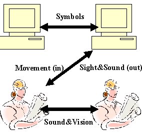
Human communication using sight and sound
Around 60% of the human brain is devoted to processing visual input.
We are good at seeing patterns, changes in patterns, contrast in colour,
contrast in intensity, movement (contrast in position and time) and
other related stimuli. Not surprisingly, we have designed computers
to communicate effectively with us primarily through visual channels.
Sound
is the
next most frequently used human input channel and accordingly sound
channels have been designed into computers as a supplementary output. Here is a draft research report on the human vision system that might be of interest.
Conversely,
humans in person, communicate with each other primarily through
sound and then movement. Over a distance we use visual stimulus through
written words. To make sounds we modulate pressure waves
in
the air around us
to
convey
meaning, intent and presence with our voice and other sound producing
devices. Other physical channels of communication are through body
position and its movement,
touch and smell. Of course,
for us, smell is
right
down the bottom
of the list in terms of communications.
There is a slight mismatch between how humans effectively communicate
with each other and how they can communicate with computers. To input
information to a computer we use movement
(mouse) and physical code (keyboard input). So we use our secondary
or supplementary information channel to input. There are systems out
there
that translate voice commands although
they require training for each new user and there is still some correction
required due to the imprecise nature of our verbal communication. Computers
dont remember history or appreciate context to gain the extra meaning
that humans do.
So, how can we make communication as effective as possible?
By making sure that the user interface, the part of the system that
we interact with the computer through, is designed to make communication
as easy and as intuitive as possible. This has been a research focus
for a number of years. It has become particularly important now that
the Internet is so widespread and is used to perform so many information
processes.
What makes a good User Interface?
As we build our framework for judging and designing user
interfaces it is important to remember that an interface is build for
a purpose and to achieve some goal. The following factors and principles
focus our attention to that goal and how effectively it is being reached.
It is all about creating an interface so that it is "usable".
Grice and the principles of cooperation
(Grice, H. Paul. 1975. Logic and conversation.
In Cole, P., and J.L. Morgan, eds. Speech Acts. New York: Academic
Press,
41–58.)
Grice put forward a theory of conversational interaction in 1975. At
that time it was focused on how humans interact in conversations but
it has since been seen that it applies well to how we interact with computers.
The key concepts are the "rules" of conversation and the principles that
make it effective.
Because humans communicate over several channels at once,
words, tone, body language, motion, etc., we can actually use some
of those channels to imply meaning opposite
to what the words actually said. There are some key maxims for conversation
that ensure that
actual meaning is reinforced rather than diluted. The basis for conversation
is the principle of cooperation. That is, both partiesobey some basic
rules and cooperate in the conversation.
Maxim of Quantity:
“Make your contribution as informative as required” (for
the purposes of the current exchange).
“Do not make your contribution more informative than is
required.”
Maxim of Quality:
“Do not say what you believe to be false.”
“Do not say that for which you lack adequate evidence.”
Maxim of Relation (Relevance)
Be relevant and assume relevance.
Maxim of Manner
“Avoid obscurity of expression.”
“Avoid ambiguity.”
“Be brief.”
“Be orderly.”
The key here is to think of human-computer interaction as being like
a conversation. If you do you can see the relevance of Grice’s
theory of conversational interaction to user interface design. It is
through
the interface that
the “conversation” takes place!
What questions might Grice have you ask of a Web interface?
Quantity: Is there enough information to allow users to perform
their required tasks?
Does it seem easy to progress?
Are there sufficient navigation queues to direct users?
Is there sufficient help and support?
Quantity: Is there too much information causing users difficulty
in progressing toward their goal?
Is the web page "busy"?
Is the web page "crowded"?
Do you feel lost?
Quality: Is the information given truthful and correct?
Are there any false promises or dead links?
Are the goods/services being advertised actually the ones
being delivered?
If you put correct information in do you get correct information
back out?
Quality: Is the information backed up with evidence?
Are there independent sources quoted that support information?
Are there credible reviews or testimonials?
Relevance: Is the information, asked for or given, relevant to
the task at hand?
Does the information help the user reach their goal?
Is the information for a purpose related to the user's goals?
Is the information appropriate for the task? (eg., inappropriate
advertising)
Is the information requested goal related?
Is the information requested appropriate to the task?
Are images and icons relevant to the task
Is decoration neutral?
Manner: Is the language used clear and straightforward?
Does it use plain English with small words?
Is it appropriate to the audience intended?
Is it appropriate to the discipline or industry?
Does navigation go directly where it should?
Manner: Is the language used ambiguous?
Is the intended meaning clear?
Is there any possibility for misinterpretation?
Manner: Is the information brief and to the point?
Are there simple, short explanations?
Are lists or points used to outline process?
Are images used appropriately to illustrate points?
Are appropriate icon images used for navigation?
Do webpages go over a single screen length?
Manner: Is there sufficient structure in the presentation of information
to make it clear?
Are lists and tables used effectively to group items?
Is indentation used to effectively indicate belonging or
encapsulation?
Is information hierarchically organised (indexed, categorised,
table of contents)?
Does navigation structure match order of tasks in process?
Norman's Principles
Donald Norman and Jakob Nielsen are probably the world's formost researchers
into user interface design and system usability. Norman published works
in 1986 and 1988 that defined our understanding of the requirements
of user interfaces for effective operation.
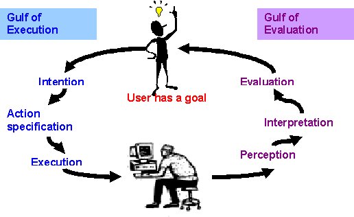
In the following section it is important to realise that each time
we use a computer or a tool or even a web page we are doing so with
some purpose in mind. We have a goal! Norman's model for Human-Computer
Interaction is based upon the actions we take after having formed our
goal and the effect of the execution of those actions. Norman's model
for HCI is based upon the following steps:
Forming a goal
Forming an intention
Specifying an action
Executing the action
Perceiving the state of the system
Interpreting the state of the system
Evaluating the outcome
The goals for the user interface designer are:
Bridging the gulf of execution:
Design the system to ease the process of getting from the intention
to the execution.
Bridging the gulf of evaluation: Design
the system so that the response after the user has performed
an
action can be easily interpreted and then evaluated.
Norman posited these four design principles to reach these goals:
Make things visible: Ensure that the user, by looking, can tell
the state of the device and the alternatives for action.
Provide a good conceptual model: Ensure the system image is coherent and consistent and reflects the
model that underlies the system.
Use natural mappings: Ensure there is a natural relationship between the look of an object
and its function.
Give feedback: Give the user full and continuous feedback.
What questions might Norman ask of a web interface?
Visibility: Can the user always see the next possible step?
Are navigation choices easy to see and understand?
Are steps in the process clearly marked?
Are the choices marked relevant to the current state of the
process?
Is an exit from the process or page clearly marked?
Is there help clearly indicated?
Is there information clearly stating what is possible and
what is not from that point?
Are there scroll bars if information is off the screen?
Conceptual Model: Is there a recognisable conceptual model (portal,
game, ladder, tree, book, etc.)?
Is the organisation of the information consistent with the
conceptual model?
Is the navigational structure consistent with the conceptual
model?
Are the actions consistent with the conceptual model?
Does the model get in the way of the user reaching their
goal?
Does the model effectively help the user to understand the
information or process?
Natural Mapping: Do the objects that appear on the webpage or
site have an easily understood action associated with them?
Are icons and images appropriate for their use?
Do items appearing on the site have all of the actions that
are appropriate for that metaphor (Window - open, close, half
open, see through, slide up and down, etc. Desktop - ?)?
Do objects do what they look like they ought to?
Feedback: If an action is taking place is there feedback to let
you know what is happening (saving, calculating, processing, loading,
etc.)?
Principles of layout: PARC, CARP, or CRAP!
Williams has put forward four principles of layout that should be considered
in developing the layout of information on a screen. (Williams, R. (1994). The Non-Designer's Design Book. Peachpit Press).
The principle of Proximity requires that all related
items should be chunked or grouped together so that the related items
are
made to appear as cohesive groups.
The principle of Alignment holds that nothing
should be placed on the page arbitrarily. Every item should have
a visual
connection with something else on the page.
The principle of Repetition: Some aspect of the
design should be repeated throughout the entire piece.
The principle of Contrast states
that if two items are not exactly the same, then make them different … really
different. Determine what you want the focus to be and use contrast
to create
that focus.
What questions might Williams ask of a web interface?
Proximity: Are related items "chunked" or spatially organised into
clearly identifiable cohesive groups?
Is indentation used to signify belonging?
Are headings used to identify groupings?
Are paragraphs used to separate topics or points?
Are images close to the text that describes them?
Are tables and lists used effectively to group and separate
information?
Alignment: Are related items aligned?
Do similar text objects (headings, paragraphs, etc.) all
start on the same level of indentation?
Do things that belong together (eg., opening and closing
tags) have the same level of indentation?
Is alignment meaningful?
Is the information structure easy to discern?
Is the connection between items on the page easy to see?
Do items such as text, tables and images have a consistent
spatial relationship?
Repetition: Is there sufficient use of repetition to create familiarity
with the site's operation?
Is there a theme that is repeated?
Are colours used thematically?
Are items placed similarly on every page (menus, etc)?
Are structures used repeatedly?
Is spacing used repeatedly?
Are the same choice of fonts used repeatedly?
Are the same menu choices and explanations available for
similar actions?
Contrast: Are different items or groupings clearly
distinguishable?
Are headings used effectively to separate topics?
Is emphasis (bold, underline, font size or italics)
used effectively to separate important or key items of information?
Are different fonts used for different types of information?
Are colours used to group related topics or information categories?
Are links and navigation clearly distinguishable from information?
Typography: Using fonts
We read text not so much letter by letter but by recognising the outline
of the words. Some fonts make text easier to read because of particular
characteristics.
Risers and descenders that are clearly visible
above and below the x-height of the text enhances the outline
of the words.
A type face that clearly outlines the curves, bowls and
straights of each letter in the word enhances the shape of the word
Sufficient spacing between letters and between words helps to
identify the word and distinguish it from others
Sufficient spacing between lines (leading) helps the eye to follow
the correct line of text
Adequate font size to make words clear and easily readable is important
There must be adequate contrast between text and background to
make words readable
Are similar fonts used consistently for particlular purposes and
actions?
Are appropriate fonts used for the intended purpose of the site?
Are there more than 80 characters per line?
Is there sufficient line spacing (leading) and word spacing to
make information easily readable?
Are font and background colours used appropriately to aid visibility
Are larger fonts used to aid readability if a dark background
colour is used?
Is sufficient font variation used to provide contrast and visibility
of different types of information?
Is sufficient font similarity used to provide grouping (topic,
level of importance, etc)
Do the fonts and typefaces (eg., italics) used make the words harder
to read?
Colour: The eyes have it!
We talked about "web safe" colours when demonstrating how to put background
colours into web pages. Colours are represented similarly for any object
that allows you to specify a colour attribute's value.
We used the
format: bgcolor="#FF33CC" or text="#330099" or
something similar. Web safe colours are those for which you should get
the same colour no matter what browser you are using.
The value pairs
that are used for each of the Red (R), Green (G) and Blue (B) values
are two digit hexadecimal numbers: FF, CC, 99, 66, 33 or 00. Their
relative values are explained in the table below. Basically, FF means
that the maximum amount of a particular primary hue is being used in
the colour mix. 00 means that none of a particular primary hue is used.
The relative saturations of R, G and B can be adjusted to give 216
different web safe colours. Browsers may display other colours apart
from the websafe set but this cannot be guaranteed.
Hexadecimal
Decimal
Saturation %
FF
255
100
CC
204
80
99
153
60
66
102
40
33
51
20
00
0
0
Various web resources explain how to effectively use colour and how to
create a colour scheme that works consistently.
There are other considerations for using colour that must be taken
into consideration. Some users may have some form of colour blindness
or insensitivity that causes a web page to appear differently. Different
cultures may historically or traditionally use different colours to
be associated with particular events or actions.
Are web safe colours used in the site?
Is a colour scheme used effectively to create an effect that is
pleasing to the eye?
Are colours used appropriate for the purpose considering race,
culture, religion, etc.
Do colours used create an appropriate
mood or atmosphere for the
purpose of the site?
The ColorMatters site gives plenty of examples of how colour affects the human condition
A simple framework for evaluating a User Interface
Remember that you go to a website or use a device with a task in mind. Here is a table
containing a set of questions that you can use to evaluate the effectiveness
of
a user
interface's
design.
In
this
case
each question can be answered using a five point scale so that there
is some graphical representation of the evaluation. When reporting it
would be necessary to justify your judgment based upon one of the principles
above.
Question
1
2
3
4
5
Is the amount of information on the site/device appropriate
to perform the task? 1: Too little - 3: Just right - 5: Too much
Are the information and processes contained
on the site/device accurate, true and correct? 1: Inaccurate - 3: Mostly accurate - 5: Totally accurate
Is the information and images contained on
the site/device relevant to the task? 1: Irrelevant - 3: Mostly relevant - 5: Totally relevant
Is the information given to the user clear and unambiguous? 1: Unclear - 3: Mostly clear - 5: Totally clear
Are navigation, formatting and information
structure helpful to completing the task? 1: Not helpful - 3: Could be better - 5: Very helpful
From everywhere on the user interface is it possible
to see where to go next to reach your goal? 1: Rarely possible - 3: Sometimes possible - 5: Always possible
Does the user interface use a consistent
and appropriate conceptual model? 1: Inappropriate - 3: Inconsistent - 5: appropriate &
consistent
Do objects appearances always match
the intended function? 1: Poor match - 3: Mostly match - 5: Always match
Is there sufficient feedback so that you always
know what the system is doing? 1: No feedback - 3: Inconsistent feedback - 5: Continuous feedback
Are related items on the user interface "chunked"
into groups? 1: No grouping - 3: Loosely grouped - 5: Tightly grouped
Is repetition used enough to create familiarity? 1: No repetition - 3: Some repetition - 5: Good use of repetition
Are items of related importance or content
consistently aligned? 1: No alignment - 3: Loose alignment - 5: Consistent alignment
Are different items and actions distinguished
using contrast? 1: No contrast - 3: Inconsistent contrast - 5: Excellent contrast
Are fonts used to provide a clearly readable
text? 1: Poor use - 3: Inconsistent use - 5: Good use
Is the colour scheme pleasing to the eye? 1: Horrible - 3: Alright - 5: Very pleasing
Is the colour scheme appropriate for the audience? 1: Inappropriate - 3: Mostly appropriate - 5:Very appropriate
Is the colour scheme appropriate for the task? 1: Inappropriate - 3: Mostly appropriate - 5:Very appropriate
Try out your framework on a couple of sites from the Week 3 section of Marilyn Ford's notes: 2505ICT-
User Interface Design
Usability
There are several methods that can be used to determine how “usable” a
system is from the users’ perspectives. Using a simple set of
heuristics or general rules is one method that is easily applied to
web sites and pages. Nielsen and Molich provide the following framework
for heuristic evaluation. Depending upon the user and the purpose of
the interface a set of questions might be generated that can be asked
of the user as they perform each task.
Heuristic evaluation
This is a method for structuring the critique of a system using a
set of relatively simple and general heuristics. The general idea behind
heuristic evaluation is that several evaluators independently evaluate
a system to come up with potential usability problems. It is important
that there be several of these evaluators and that the evaluations
be done independently.
Ten usability heuristics (Nielsen, J. and Molich, R.)
• Visibility of system status
•
Match between system and the real world
•
User control and freedom
•
Consistency and standards
•
Error prevention
•
Recognition rather than recall
•
Flexibility and efficiency of use
•
Aesthetic and minimalist design
•
Help users recognize, diagnose, and recover from errors
•
Help and documentation
Create a text heading in the top left corner "User Interface
Design"
Recreate the UID framework template in the spreadsheet so
that has the questions are in a left hand column and each
of the columns to the right can hold numeric scores (1-5).
Spreadsheet example
UID Question
Website 1
(good site)
score 1-5
Website 2
(bad site)
score 1-5
Your project site #1
score 1-5
Peer project site #1
score 1-5
Your project site #2
score 1-5
Peer project site #2
score 1-5
Is the amount of information on the site/device appropriate to perform the task? 1: Too little - 3: Just right - 5: Too much
Etc...
Set aside seven columns (stretch to suit text) and place headings
similar to (example above):
UID Question
Good Site
Bad Site
Your Project Site #1
Peer project Site #1
Your Project Site #2
Peer project Site #2
Think of a website that you like and one that you dislike. If you cannot think of any then follow the link to Marilyn Ford's UID site and find a couple of example sites to view there.
Use the UID framework in your spreadsheet to give each a set of scores. This is practice for the next question that will help you collaborate with a peer to improve each of your project web sites.
Get together with a peer in your lab class and swap student numbers so that you can each access both of your websites on Dwarf.
Working with your peer you should both collaborate to:
Record the URL for both of your websites
Score each of your websites using the evaluative framework and record them in the spreadsheet
Create a text box
Write a justification based on the UID theories of why you have given your scores
For each website write a list of items that you and your peer have agreed on should be changed to improve them.
Execute the agreed changes to your website as per the list and
Repeat steps 8 & 9 with your peer to record a new evaluation
Save the Excel workbook as "analysis.xls" and then copy it to dwarf and create a link from the week 4 area of your "My Project" table to the spreadsheet.
Create a simple web page with a title and heading of "Colour Schemes"
Create 4 tables as "colour swatches" with examples of the following colour schemes. You should go to Marylin's site/page on colour schemes (the link is in the section above on colour) Do not copy the examples from Marilyn's site but create examples of your own:
Analogous
Complementary
Monochromatic
Triadic
Here is an example of a table as a colour swatch:
After each table (some may have different numbers of columns/colours) you should explain what it is that defines that colour scheme. This is also on Marilyn's colour page.
Create a colour scheme for your project business describing the use of colour for text, images, backgrounds and other features.
Create a set of colour swatches for your colour scheme
Justify your scheme based on your project business type, its clients, cultural operating environment and any other important factors affecting colour choice.
Font Family is the basic font family that you can use. The font families are "serif", "sans-serif", "monospace", "cursive" and "fantasy". The first three are known by all browsers but the last two are not so well implemented. Feel free to try though.
Here
is a "CSS Style" that will help you set up colours for the background, text colour and font family on your page. Simply place the code below somewhere before the closing </HEAD> tag in your HTML page. Change the attributes: color, background-color and font-family to something that you find pleasing or interesting. If you want to find out more about styles look for online tutorials on Cascading Style Sheets next time you do a web search. There is some good stuff at: "HTML Code Tutorial"